Hottest Window Covering Colours of 2017
We’re fortunate enough to see the world in full colour. It’s this ability that has opened us to a breathtaking array of possibilities in art and design. For interior design, the play of colours with one another is so crucial that colours are usually one of the first trends to change every year.
These are the colours that will define 2017:
Don’t worry, be yellowy
Yellow is, hands down, the hottest window covering colour of the year. Encompassing all tints and shades on the yellow spectrum, your window coverings will look trendy from maize to canary to mustard. This optimistic colour of pure joy is trending perhaps as a result of how 2016 seemed to be such an exceptionally terrible year. The colour certainly would have its desired effect of cheering people up because yellow never fails to brighten up a room. It’ll work even if you use it subtly in the patterns of the blinds rather than making them one solid colour. 2017 is all about looking for that spark of light even in darkness.
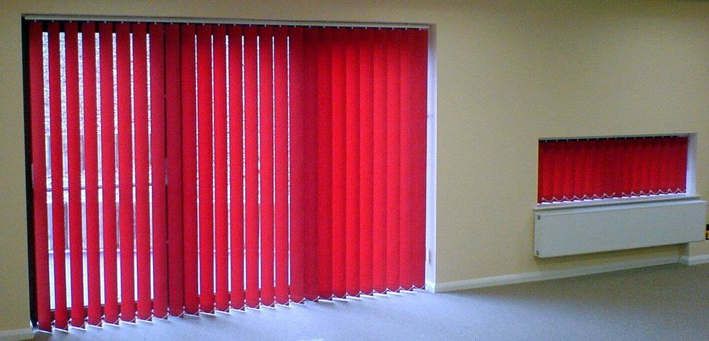
Window gems
This year, people are also very enamoured with the deep tones of gems like ruby reds and sapphire blues. When the sunlight streams through your blinds and shades, your windows will look like they’ve captured the hidden depths of gems. These darker colour tones give an air of sophistication to the house.
Fruit of life
On the other end of the scale, you’ve got the bright colours that are also popular. In particular, it’s the vibrant colours that bring to mind all the fresh fruit of the world. Delicious fruit like sun-kissed oranges and sweet kiwi. These bold colours add a whimsical feel to the interior that’s at once modern, cozy, and artistic.
Dark side of neutral
Here, we bring it all back to the centre. Neutral colours (shades of white, grey or black) are always a safe design choice because they bring out the best in any colour scheme. This year though, the trend has shifted slightly to favour the darker neutral shades. So if you are ready to tread the path to the full power of the dark side, embrace charcoal and slate.
Your precious
Gold, silver, platinum…we’ve had a fascination with precious metals since we first set eyes on their lustrous qualities for thousands of years. Our thoughts turn to them again this year by weaving their inspirations into window coverings. You can use fabrics with a shiny façade or with printed glossy, geometric patterns in colours that mimic your favourite precious metals. Bonus design tip: the sheen of the patterns will show up much more richly against a dark background. You can actually combine this look with the window-gems idea by using the deep gem colours as the background. Much like with the gem tones, the precious metals inspiration will bring sophistication to the house as well as a sense of refined luxury.
Down to earth
If you prefer a low-key design with elements that help you get back in touch with nature, then window blinds of wood or bamboo are just right for you. The natural materials will remind you of the simpler pleasures in life and the importance of taking the time to appreciate them. They’re also perfect for houses with a rustic feel.
The colours you choose for your window coverings are more than just how they fit with the interior design. They’re also how you want the world to perceive you. Remember that even when window coverings are drawn, you still have the opportunity to showcase your personality.

