THE INTERIOR DESIGN GUIDE TO COLOUR SELECTIONS – PART 2
You’ve got your starting point and colour schemes that mean something to you in Part 1. Now let’s look at other ways to select colours for your home:
THEMED COLOUR SELECTIONS
Why reinvent the wheel if there are colours that have proven to work well together already? Going with themed colour selections is the easiest way to do it if you’re open to outside ideas.
First off, you can always get a palette of the hottest colours of the year and try different combinations among them. The only risk with this idea is that if colour trends change dramatically in the next few years, your house may start look dated.
Love nature and want to re-create some of your favourite landscapes with colour schemes? Go ahead and borrow the palette of beautiful sceneries you adore! For example, you can use mixtures of tan and azure to bring in the seaside feeling. Or how about a woodland experience with shades of leaf-green and tree-bark-brown? And don’t forget the look of mountains with charcoal grey and cobalt tones.
Another idea is to play with light or dark colour schemes based on the mood you want to set in the room. In general, lighter colour shades open up the room make it seem more spacious and cheerful. Darker colour shades, on the other hand, lend a cozy and intimate feel to the room.
TIPS ON MIX-AND-MATCHING COLOURS
If your house has an open-concept layout, treat the whole area as one zone. In these cases, use complementary colours from a colour wheel or those of the same hue spectrum.
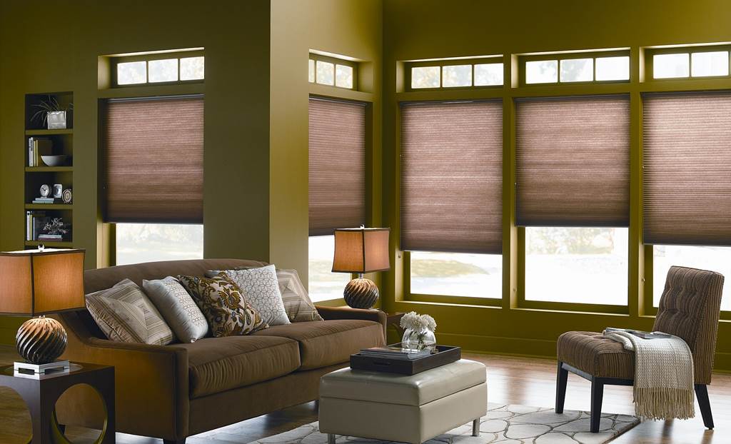
In terms of colour placement within each room or zone, a sure-fire way to decide is going progressively from darker shades at the floor level to lighter shades near the ceiling. Make sure you also take full advantage of window coverings such as roller shades. They’re great to juxtapose complementary colours since they have wide surface areas right at eye level.
We talked about personalized colour selections in Part 1 where you can highlight a particular permanent item that you hold dear to your heart. To place the focus on that item, make sure the rest of the accent colours in the room are a few shades lighter than the item’s primary colour. Also, even if you like the look of several different colours combined together, remember not to go overboard with the number of colours you use either. Keep it to a maximum of four colours; otherwise, your whole house would look too busy and disjointed.
You may have noticed that we didn’t mention anything about common areas like hallways or foyers in this guide yet. Well, we thought we’d leave it to the end as the ribbon bow to finish it off. And just like how the ribbon holds a package snugly, the common areas are what tie the interior design of your home together. As such, you should always use neutral colours on them so that each room or zone smoothly transitions to the next.
And that, in a nutshell, is how interior designers do it.

